 | |||||||||
Designers throw the word "hierarchy” around a lot, but establishing a hierarchy is only half the job--a design must have a hierarchy that accurately reflects the information value of each element on the page. I call it "right-sizing"--or perhaps more accurately, right-emphasizing elements because size is not the only way create visual differences in importance. It's common to see pages that give too much emphasis to trivial elements and not enough to what's important—these pages feel disorganized and can confuse readers. | |||||||||
 |  | ||||||||
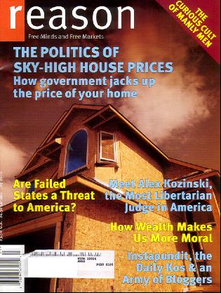
This magazine has a good art director, you can tell because of the elegant spreads on the inside like the one above. The covers, however, are typically a mess of competing elements. The main headline and deck form a unified blob and the art, which could be haunting if it was given a little breathing room is covered with teasers. Many magazines, even intellectual magazines like this one, feel the need to "out shout" competitors on the newsstand--hard to do on a budget.
[As with all my "improvements," this one is not meant to represent a final solution, but an improved direction .] In this version, the headline is clearly delineated from the deck, and the teasers are no longer competing with the main head for attention. More importantly, the art which is the most intriguing part of this cover, is not rendered moot by a sea of verbiage. | |||||||||
 | |||||||||
 | ||
Nearly everything is going right here, but with that great photo, why is the "L" the dominant element on this spread? | ||
 | ||
Knocking the initial cap down to size, and also putting the headline rather than the subhead in black, which has more visual weight makes this spread feel a bit more organized. There may be times to use a giant drop, but it's hard to argue that this is one of them. The "L" doesn't illustrate the topic. | ||
 | ||
A minimalist spread. It works however because everything is the right size. The big head adds punch, the headline feeds into the deck and then the story. Pull quotes and the sidebar are interesting enough to be noticeable but don't overwhelm the main article. The slightly off-center layout makes the spread dynamic. NEXT | ||