 | ||
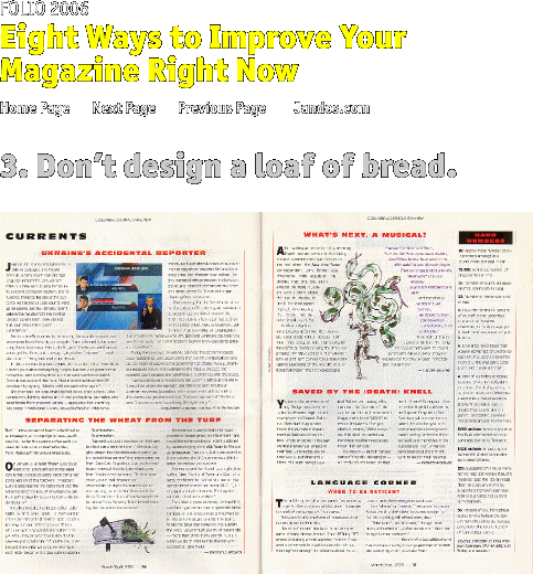
Like a slice of bread this spread exhibits a consistent texture. Nothing jumps out—the art is small the headlines are small, the standing heads are small. The result is visual tedium. | ||
 | ||||
 | ||||
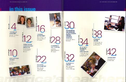
The same is true with this contents page. It has a bit more pop, but giving all photos the same graphic treatment--goofy angles and fake snapshot frames, is equally tedious. The page numbers also get too much emphasis--no one cares where to find an article until they've decided they want to read it. | ||
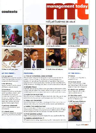 | ||||
Management Today solves bread design by combining a bunch of small items into one unit. The page has more impact as a result. | ||||
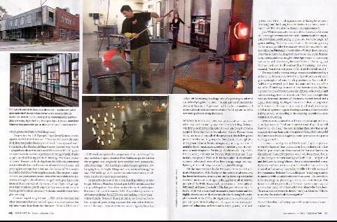 | ||
A nice spread from Preservation. Despite the simple two-column structure, the photos form a coherent unit, and each is proportioned to its own size and shape based on pictorial interest. Despite the simplicity, this is a very inviting pair of pages. NEXT | ||||