 | ||||
 | Like the Reason cover shown previously, ineffective design is often the result of treating a photograph or illustration like a blank sheet upon which words can be placed at will. Actually, art imposes an order on the page just as certainly as a grid does on an all-text page. Good feature and cover design comes out of finding and working with the structure the photograph provides--and designing to complement rather than compete with an image’s strengths. This Rolling Stone cover from a few years ago is an excellent example of listening to an image. Note how the type gets bigger and smaller in the space carved out by Kidman. | |||
 | ||||
This cover is problematic for a number of reasons. The portrait on an unidentified man with the headline "Partners in Protection" makes little obvious sense. But, the reason this cover is here is the deck. Putting the deck above a high contrast area nearly guarantees it won't be readable. Perhaps putting the type over the shoulder and capitol dome would work better; or putting the head on one line and raising the deck could work. It would be better still to find a photo with less detail. | ||||
 | ||||
This text is readable enough, but the designer is undermining what makes the image interesting. The old style marquee has a lot of charm--or would if the sign was not reduced to a wedge-shaped blob by the type that is visually linking the lower and upper signs into a single unit. A gentler type treatment would be readable, but would still allow the image to feel open. | ||||
Here the designer is competing successfully, but hardly gracefully, with a busy background. The type is thrown all over the place in an effort to find nooks and crannies where words might go. Too many colors and tricks are used. The result is legible but not readable--it's hard to know where to look. One way to know you are competing with your image is if you find yourself using lots of drop shadows and outlines. Too many gimmicks enlisted to pull type out of the photo likely means you're fighting a losing battle. | ||||
 | ||||
 | ||||||
Nice example of picture whispering. This cover doesn't try to "out shout" other magazines on the racks. Instead it relies on a photo with a bit of drama, and puts text where it can be seen and read, but not where it will fight with the image's detail. | ||||||
I think illustration is a great cover option for small magazines because it gives the designer control over composition. The above Nicole Kidman shot probably cost Rolling Stone as much as my quarterly art budget. While it's hard to get a cover image like Rolling Stone's without stylists, set builders, assistants and caterers, illustration deals directly with ideas and can easily be planned with the limitations of cover design in mind. | ||||||
 | ||
Picture whispering comes into play in feature design as well. This is a bright and lively piece of art. Making the headline equally bright and lively (and H-U-G-E) competes with rather than complements this illustration. The cherry on this ill-conceived sundae is that the word "harvesting" actually covers up the hand doing the harvesting--undermining the text/image connection. The summary box and standing art are also distracting. In short, this package has too many colors, too many sizes and styles of type, and too little thought. | ||
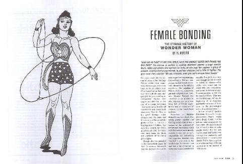 | ||
Nice though simple spread from Bitch magazine. The tall thin columns and centered layout play against the tall thin centered figure on the other page. Even though there is no interaction between pages, they were clearly designed to be seen together. This is simple, but it's easy to look at and easy to read. NEXT | ||